Overview of the Project
Summary
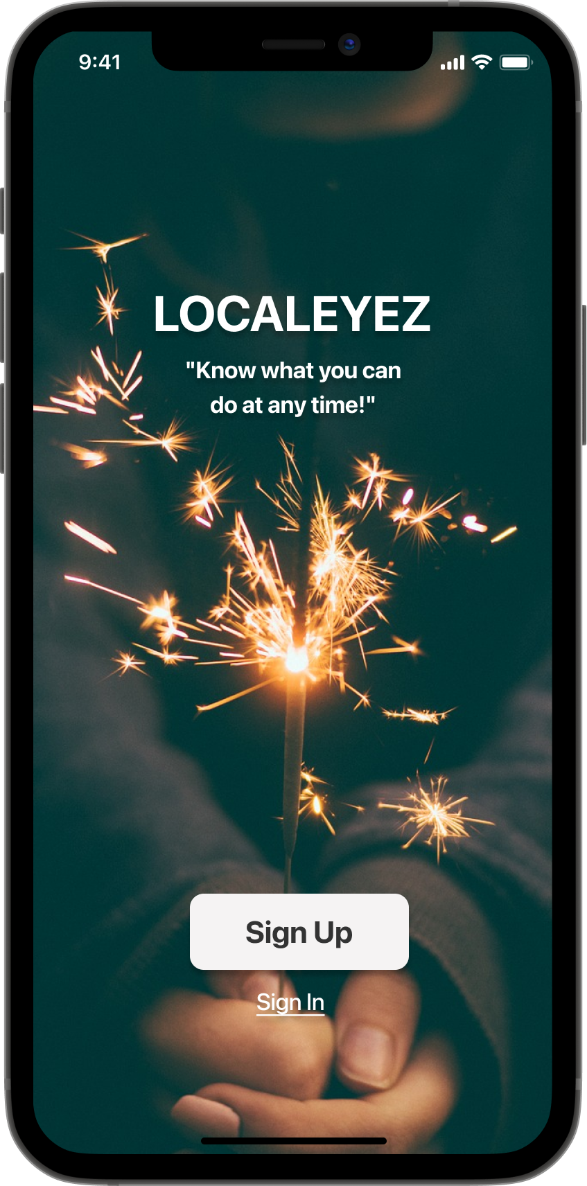
LocalEyez suggests local events and experiences determined by your interests. The app uses innovative machine-learning technology that will use the user's current inputs, personal profile, and past events to improve the tailored experience.
Roles & Responsibilities
UX Designer
UI Designer
UX Research
Problem
"you will be providing users with a personalized dashboard that addresses their interests when looking for events and experiences."
How can users find activities they want to go to? (The app helps them find a local activity to attend).
How can users be more engaged with the app? (The app provides personalized information that makes it more relevant to them, as well as more interactive and fun).
How can users feel that they have control over what they see on the app? (The app gives them control over their app preferences).
Business Requirements
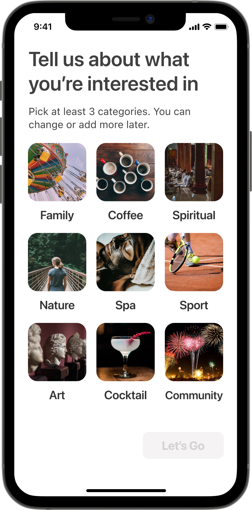
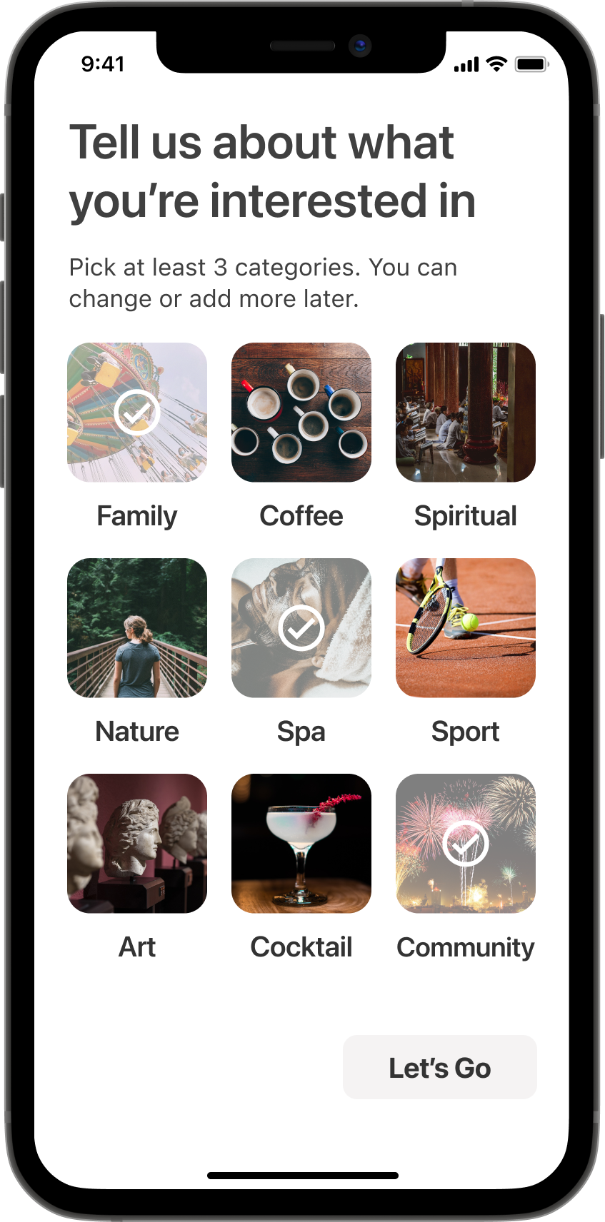
Onboarding: Your team wants to see an onboarding flow that's similar to MeetUp or Flipboard's onboarding process. Do you have any ideas on how to make this process more intuitive?
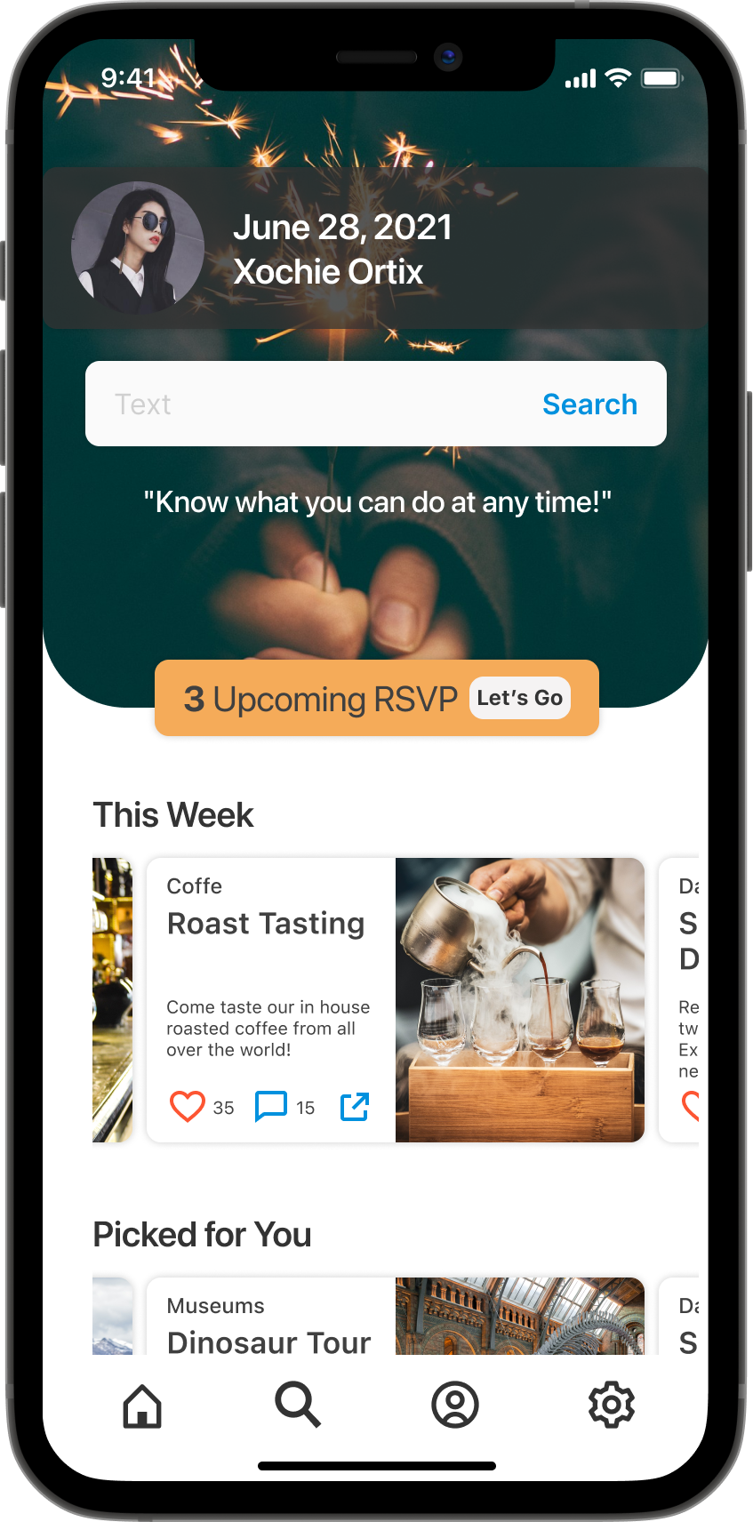
The remixed layout of "The Feed" for mobile: Your team wants to see how The Feed will look on a mobile platform. What changes will you make to the design? What patterns will you use?
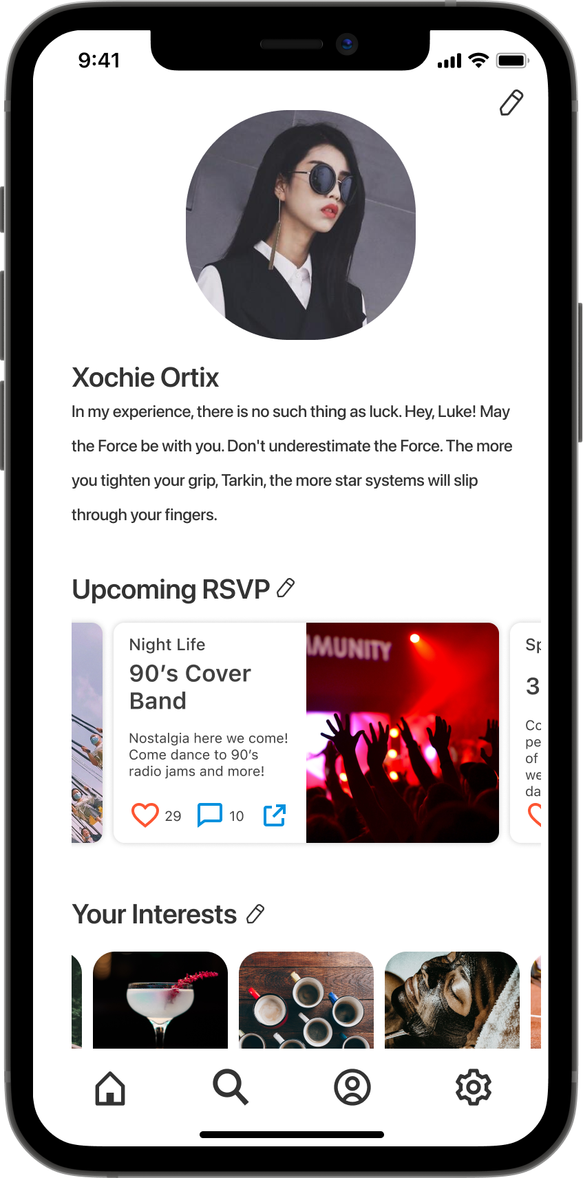
Redesigned User Profile: Your team wants you to completely redesign the user profile screen. You can use the website wireframes as inspiration but they want to see something completely new that enables the user to easily update their bio, choose new interests, see an archive of their past events, fill out their payment information, and add a location.
Target Audience
Age: 21 to 50 years old
Annual income: $30,000 to $120,0000
Location: Large Urban Areas, United States
Interests: Food Tours, Bar Crawls, Trivia Nights, Hiking, Festivals, Block Parties, Art Walks, Sports, Nightlife, Concerts, Board Games, Family Friendly, Bowling
Attitudes: Optimistic, Social, Seeks Spontaneity
Challenges: Social Isolation due to Urban Culture, Lack of Time and Organization for Family Outings, Friends are Picky
Solution
This app will use your location; the time of the year, month, and week; your interests; and information about your lifestyle to provide you with personalized activities.
Activities can range from introductory art classes, block parties, and food tours.
You can filter activities based on price, location (such as between 1 and 5 miles, 10 and 15 miles, etc.), and atmosphere (using qualifiers like family-friendly).
Discovery & Research
Competitive Analysis
Airbnb Experiences: This is Airbnb's initiative to build connections between its visiting customers and locals. Users can choose categories, hosts, and locations to find something that interests them. Categories for experiences include animals, cooking, adventures, and more. Choosing a host allows users to select an experience by clicking on an image of a person and a description of the activity, such as "mole cooking class with an Indigenous cook." And users can search for locations to stay in either locally or around the world.
ClassPass: Classpass is a fitness membership that gives its customers a range of exciting workout choices. Founded in 2013, ClassPass has over 8,000 partners in 39 cities worldwide, allowing its users to work out wherever they live and travel. Its proprietary technology lets users choose from over a million fitness classes in an easy booking process.
Foursquare: Foursquare is a location technology company that consists of two apps, Foursquare and Swarm. Their B2B offerings include Places (for developers), Pinpoint and Attribution (for marketers), and Place Insights (for analysts, based on the world's largest foot traffic panel).
Meetup: Meetup is an online service used to create groups that host local in-person events. The company had more than 35 million users as of 2017. Customers can use Meetup for networking purposes, to make new friends, or to find an activity group.
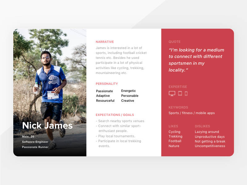
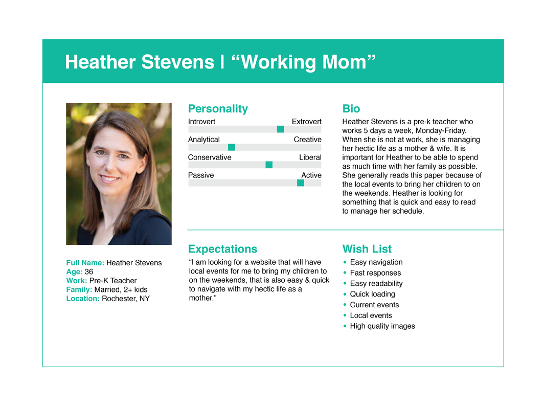
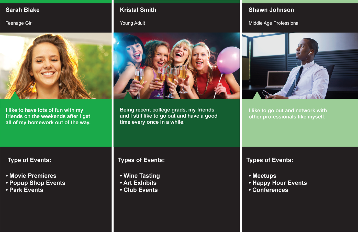
Personas
Information Architecture
User Flow
Site Map (Website)
Site Map (App)
Wireframe
Brand Development
Tagline
"Know what you can do at any time!"
Mood Board
Interface Inventory
Sketches
User Testing
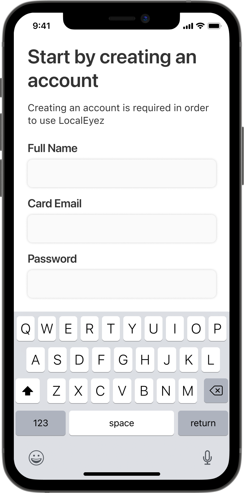
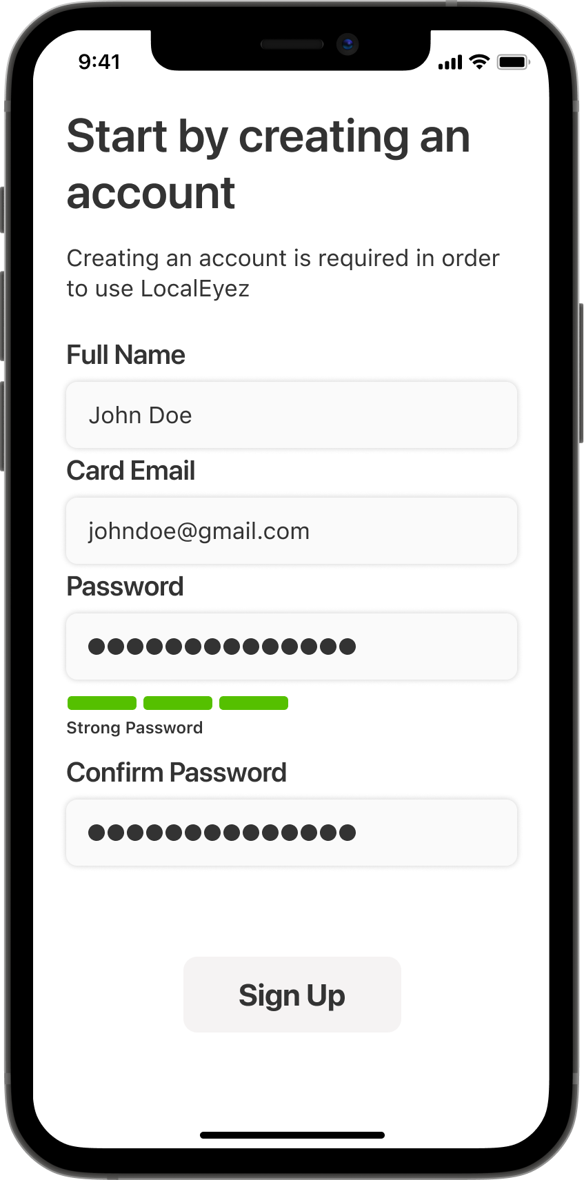
To evaluate the LocalEyez app's onboarding process, I conducted Guerrilla testing with 6 users. Relying on verbal feedback and visual observation, I was able to gain a deeper understanding of the user experience.
I sat at a table at my favorite coffee shop with a sign that said "do you have 15 minutes to test my app?" I kept this sign up until 6 people had approached, sat at my table, and run through the prototype with me.
I asked each volunteer to "create an account and view their profile." While testing showed that the task was pretty straightforward, there was a bit of confusion around the "Now let's find your first event" screen. In the interaction of the prototype, I removed this screen entirely.
High Fidelity Prototype
Key Images

Final Thoughts
The LocalEyez app is still subject to iteration. As a UI designer who entered this project later on the road, it was a fun challenge to quickly adapt all the research and design that had been executed prior to my arrival. Not only was I able to integrate a personal style into the app, but I was also able to reinterpret the design and make it more modern and vibrant, just like our users.
